Category Archives: WP #2 EOA
Evening of the Arts (Front and Back)


Front and Back Cover of the postcard.
post card


My postcard design changed a lot from what it originally was. At first i was going to make a splotchy background for the front of the post card but i guess it didn’t fit like i thought it would because the splotchy idea was originally for a poster and not a postcard. I guess i kinda like my design now because its very simple. I also like the colors on the front of the postcard.
Evening of the Arts


My original idea was use black and green to do the design. It is really different than this. This idea is make this postcard looks like a notebook. All the pictures and words kind of paste on the background. I was confusing about which colors could I use. I tried the black first but is not look that good so I change the color. I think the the back of the postcard is a little bit empty.
EOA Design
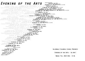

I originally started with a much simpler design that incorporated red triangles with a black and white image for the background but I later found that it was almost scary looking so I then decided to incorporate themes for a non smoking ad and completely change my design. I had trouble with the learning curve of Indesign took me a while but it turned out great.
Evening of the Arts Post Card


My original idea for this project was to have the pictures look like a staircase going from the right to the left of the postcard. As i worked on it, i changed my idea because i found that i couldn’t fit everything on the postcard in a way that it wouldn’t look too busy. I think the end result turned out how i wanted it to. I like how simple, but colorful it turned out.
 My original idea for this was very different from what you see here. I wanted to block everything into its own little windows and include a lot more student artwork. But I ended up finding a poster that I really liked that I wanted to make my own that was totally black and white and included several different fonts and shapes and textures. S0 I took that idea and I put my own twist to it. I really like the end result of this and even though I wasn’t too enthusiastic about changing it in the beginning I think I like the end result better than the original idea.
Dai_Postcard For EOA


Well, I wanted the bottom like the music volume. top like the melted chocolate dropping . And then I changed them in little bubbles, because i want them like more kinetic. So it become how it looks like now.
Evening of the Arts Postcard


My original idea for the postcard was to have a white background and make the words colorful. I was also going to use the same pictures on the postcard as I did on the poster, but that didn’t end up happening (except for the playground picture).
The original postcard idea changed as I worked when I began to place the pictures. I tried a black background and the pictures looked really good on it. Then I used white words and those also contrasted well on top of the pictures and black background. And it was basically finished! I think that plain and simple was the way to go 🙂
I like the finished product a lot. It is simple yet the colors contrast well, and the slanted words fill more space. I am pleased with how the postcard looks.
EOA Postcard


The assignment was to create a postcard for Evening of the Arts, a night where art and music from all three divisions are displayed and performed for all to see. The postcard is sent out to the Allendale Columbia School family.
My original idea for the project was to have Evening of the Arts at the top, and pictures below the type– a very symmetrical design. I also was going to have small type in the background too, but it was too colorful.
My idea evolved when i noticed everything was too crammed and colorful. I guess I went too far with the color. So I made the cover (arts, arts, etc) a larger text, and all one color. The back side, I used the large “arts” text in the background, and the pictures and text color boxes.
I think my end result came out very well. I actually feel really confident about it, and think it’s one of my best pieces this year. Overall, I learned that simplicity is key- you do not have to fill the entire space!
