 I like this post because of its complex simplicity, it is eye catching and I also like the way the font size increases just as though the type was the mountain itself. I would like to try to include the increasing font size in my poster.
Category Archives: WP #1 Poster Design
Typography Poster
These examples of typography are really cool. I like the simplicity of the “KINA GRANNIS” one, and how the rain/stars are eventually made into the name. The stop wasting water one is really eye catching. Ms. Oliveri has showed us that we need to do something that’s eye catching. This vibratnt yellow really catches the eye on an important issue.
I like the “Kooks” one. The way the designer made the background “Krooks” a lighter shade was really nice. The way the glasses are incorporated into the type is really nice.
In all of the works, I noticed that the type is very simple. Making type in a simple font will help the the aesthetics to the readers and not make the work look so crowded. It also I think adds more “class” to the work. More complex fonts look cheezy and not well done.
“Faith, Hope, Love” Poster

I like the look of this poster a lot. What I like most about it is that it’s both simple and complicated at the same time.
It’s simple in that there are only a few words, the text is clean, san serif.
It’s complicated in that within that text, there re many different colors, and many different textures to add depth.
The white lines that are scattered around the poster are useful. Rather than having the eye drawn to one particular spot, the lines help to draw the eye all around the work so the focus is not a single point on the poster, but it is the poster.
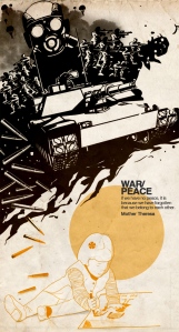
Poster
I like this poster because the whole poster is seems simple but the idea is really good. It is really creative and the font is easy. The color and the context are mach. Show us a main idea use a really easy way. The war and peace together shows the really different between it. And I like all the things that author used!
I liked this poster because of the simplicity. The whole picture kind of leaves you to decipher the picture how you want. There are several different parts of the picture that make it interesting. There is drop shadow under the triangles that makes the picture stand out in my eyes. This poster is very open to different ideas. I could use this to help enhance my EOA design in many ways. One being that I can take the idea of simplicity and use it. Instead of making my design very elaborate and full and busy, I can make it simple and appealing to the eye.
Eye-catching poster
I think this one is really great, especially at the typography part. The title integrated in the falling stars. Made this poster tranquil and full of kinetic. The sky with the gouden star makes you fell inner peace. I think I should try to make the font of the title actually blends in the poster.
picture via Kina Grannis
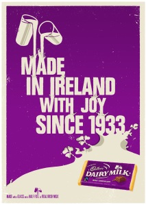
Two posters
I really like these two posters because they have colors that are easy on the eyes (and the words contrast well against the background), they both get the point across with a few words, and the actual pictures that the words or lines make are very cool. For example, the chocolate poster shows milk spilling on the words at the top, and it gives the impression that the milk runs over the words and into the milk river at the bottom. The horizontal fire is very plain, yet quite eye-catching at the same time; the path that follows the plane forms an “F” (because of horizontal fire), and the words sit on the letter, not using up any more space than needed.
On my poster, I am going to try to have good spacing and not make it look crammed. Also, I am going to stick to two fonts throughout the whole poster and make sure that the word colors are easy to read.
Kobe Poster
I chose this poster which is a tribute to Kobe Bryant. This first caught my eye because i am a huge basketball fan and i love watching Kobe play. I also really liked how the the background looks like a basketball court. I really like how the purple seems to splotch off of Kobe’s uniform and the basketball. It looks really cool. I also really like how the the designer stuck the 4 into the court. i guess something i can use from this poster is how the background really seems to fit with the central part of the art piece. Kobe is a basketball player, and the background looks like a court. i could make the background of my piece look like kind of like a canvas or something pertaining to art.
Typographic Posters to Influence EOA Project
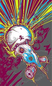
I was particularly fond of two pictures as I scrolled through, but one of them I did not find relevant to the topic.
Though I think that this piece is amazing, I don’t see any typography in it in the slightest and don’t know what it is trying to advertise specifically.
A piece that I found extremely relevant and at the same time very useful was this piece nya:
This poster is simple, elegant, and clearly displays the idea that it is trying to advertise.
Cadbury Poster
I like this poster because I like the contrast of the white letters on the purple background. it’s very simpe but it still looks nice. I also like the illusion of the milk because it looks like it is flowing all the way down the page. The little droplets that are shaped like shamrocks are also a really cool touch.


