The Hot Air Balloon

Balloon


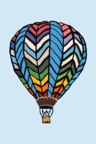
As I was painting this, my idea changed for how I wanted it to look. At first, I used the eye dropper tool to find the exact color for every part, but then as I was looking at it, I noticed that none of the colors were really going well together. To fix this, I started to follow a pattern with the colors so that all of the colors went together.

I have painted in real life in previous art classes and on pottery. I liked virtually painting a lot better than painting with real paint. It was easier to paint virtually, because you can zoom into the picture more than you can in real life. It’s also easier because the paint on the computer isn’t runny and messy. Virtually painting was a little harder in the sense that when you zoom in too far, you cant see the picture well.

My favorite part of this picture would have to be the bottom of the balloon leading down to the basket. This is my favorite part because it looks so realistic and neat.

If I could go back and change anything, I would change the background. I would maybe make the background a little more detailed. I wanted to show a few clouds in the background, but I couldn’t figure out how to make it look as realistic as it did in the original photo.
WP #5 Digital Painting

Digital Painting Assignment

  1. Select a digital image (that you own the rights to or have taken)
  2. Open your image in Photoshop
  3. Create a new layer to start painting on
  4. Use the eyedropper to select colors
  5. Use the tablet and the paintbrush tool to paint the image

To turn in the piece submit a new post to wordpress and answer the following questions…

  1. How did the image evolve as you painted it?
  2. What experience do you have painting in real life (not virtually)? How did this compare to using paint and paint brushes? What was easier? What was harder?
  3. What is your favorite part? Why?
  4. What would you change if you could go back? Why?

TypeFace Self Portrait

Bilinski_FACE

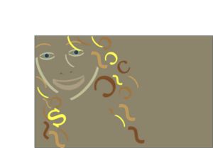
While I was working on this project, I noticed that my face was more of an oval shape. At first, I thought it would make the project harder, but it actually was easier to show the oval shape then I think it would have been if it was more round. I think this because the parenthesis fit the shape of my face well.

For my hair, I used “s” and “c” because I think it showed the curls well. I think the curves in the letters were about the same of my actual curls in the original picture.

For the whole picture I incorporated the colors from the original photo into the typeface. I thought all the colors went together well and blended together well. My original idea was to just color my hair and nothing else, but then the black in my face was too bold and stood out too much.