Final Project

For my final project of my 9th grade Digital Art year :(, I decided to do another digital painting. As with my other painting, I took on the challenging task of painting a person, however, this time, in black and white. This brought new challenges to me because the colors are so similar and making sure they did not blend together was difficult. The background color was a challenge for me. It is not the same as in the photo because, as I mentioned, the color blended too much with the shirt.

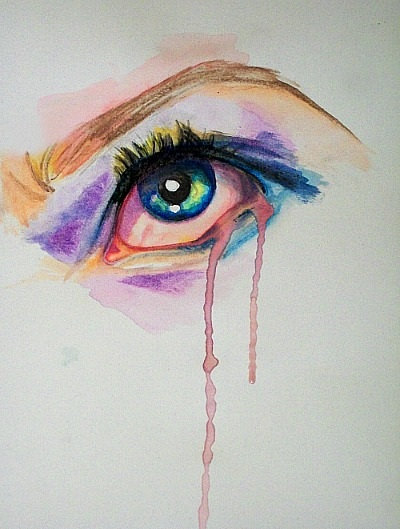
In my original proposal, I thought I would add a creepy eye-drip effect on my painting, kind of like Alex’s (Bollywood’s Best Grumpy Cat) demon-like depiction of Julie. Yet, I wanted to keep this painting pure, and I didn’t like having a creepy effect on such a nice photo. if I did take that approach, however, I would have possibly made the drips be a different color (or an actual color/not black and white), to make them pop.

I’m glad I did another digital painting for my final project. With the limited time I had, as I worked on my Flash Animation project for what seemed like forever, I wanted to do something I knew how to do. I am also glad I took Digital Art. This was such a great class. Although MANY challenges were put upon me, I tried my best to fix them and became a more patient person, in my eyes. Thank you, Mrs. Oliveri for all your help throughout the year. I really appreciate it and can’t wait for another class with you!!

P.S. I will add the photo/final outcome later. It wouldn’t let me upload it…?

Final Project Proposal

211005_3075592_i il_570xN.386244740_4ybp bjork-eyesFinal.Project.Pic

For my final project, I plan to take a photo from an old AC yearbook, and scan it in and do a digital painting of it using Abobe Photoshop CS6. I will try to make this digital painting different from my last one of my sister, by possibly adding more layers and using the opacity to make blemishes and other features of the face more prominent. I may also use a watercolor feature in photoshop, like shown in the other photos. The photo of Marilyn Monroe is my inspiration, because of the clean lines and the shadows being used appropriately,  really making the painting look more realistic.

(The photo of the boy eating the cupcake is the image I plan to use for the painting)

Flash Animation Project

I am finally done!! This project was very challenging for me, even though this is beginners work. Making the wheels turn was the most challenging part for me. Once I figured it out, however, it was easy. I learned from this project how to use other resources to find information on how to do things in Flash. Using the internet and classroom peers were ways I problem solved. I would have liked to make headlights and taillights turn on, but after the tedious work I did to make the wheels turn and for the background color to change, I was finished.

I enjoyed this project , even though it was challenging. It made me use my resources and taught me how to use a new program. I would have liked to get more skills on how to use adobe flash in the beginning, but maybe that was the point to not give us any help.

Adobe Flash Project Proposal

I have not used Adobe Flash before, so I was thinking of going the simpler route. My idea is to have a car going down the street, and maybe have the letters of a car brand falling behind it.

Packaging Re-Design

I have this cologne, called Armani Sport Code. I noticed (just now) that it’s a very simple and boring design. Simple can be good, however, this is too simple. The black background with the Red and White type looks too bland.

I added the raindrops, thinking that that would enhance the product. I used my ideas from my EOA Postcard with the “ARTS” in decreasing opacity as it travels down the page.

I didn’t really know what else to put on the product. I imagined my other cologne bottles, and they are all simple. If this were to go to the shelves, I think more men would buy it because of the eye-catching design of the enhanced colors in the letters.armani-sportFlood.Packagingdesign

What Inspires Me?

This is a video about a special needs kid who plays basketball. He was never given the chance to ever get into the game, but this time he did, and went for the gold.
This video is inspiring to me because I can relate to it. I have a special needs brother, and I know how it feels. Many people do not give disabled people the chance to do something that may be difficult for them. And many times, other “regular” people like you and me, pick on them for it. And this kid was given the chance– by the other team no less!!

This is truly inspiring to me. The fact that the person from the other team let him not only score, but win the game, is uplifting. I sometimes think that our world only accepts perfection, meaning if you are overweight or have a mental or physical disability, for example. But this kid proved me wrong.

I think I will try to, for say the packaging design, use this for inspiration to make a package for a product, say a video game designed for disabled kids, or toy for disabled kids. This will be a good thing to put to use, because, many disabled kids cannot play with the toys we can, or have the brain capacity we have to play a video game.

Typeface

Flood_Typeface


While working on this project, I noticed that my face, or any face is really difficult to depict in a drawing or typeface work. In this photo, I am laughing with an open mouth, which made hard for me to find a proper character(s) to use for it. Glasses are really difficult as well. Making sure that the eyes and lenses look good together was one of the things that I wanted to make sure looked the best.

I used the font Cochin. I used Cochin because I liked how it looked- it’s a serif, and I particularly like how it looks on the ears, with the “G” I used. It is nice and it stands out. Serif is difficult because it has the little “tags” on the ends of the characters, but I made it work.

I didn’t have this vision int he beginning, of the white with only the tie being colored. But I think it really stands out. In past work, like during critiques, Ms. Oliveri asks us “what aspect of the piece does you eye go to first?” And that’s what I tried to do it this piece. The tie is what your eye is suppose to go to first. It’s also my favorite part of the typeface.

EOA Postcard

EOA_Postcard_back EOA_Postcard_front

The assignment was to create a postcard for Evening of the Arts, a night where art and music from all three divisions are displayed and performed for all to see. The postcard is sent out to the Allendale Columbia School family.

My original idea for the project was to have Evening of the Arts at the top, and pictures below the type– a very symmetrical design. I also was going to have small type in the background too, but it was too colorful.

My idea evolved when i noticed everything was too crammed and colorful. I guess I went too far with the color. So I made the cover (arts, arts, etc) a larger text, and all one color. The back side, I used the large “arts” text in the background, and the pictures and text color boxes.

I think my end result came out very well. I actually feel really confident about it, and think it’s one of my best pieces this year. Overall, I learned that simplicity is key- you do not have to fill the entire space!

Typography Poster

33 Print 12

These examples of typography are really cool. I like the simplicity of the “KINA GRANNIS” one, and how the rain/stars are eventually made into the name. The stop wasting water one is really eye catching. Ms. Oliveri has showed us that we need to do something that’s eye catching. This vibratnt yellow really catches the eye on an important issue.

I like the “Kooks” one. The way the designer  made the background “Krooks” a lighter shade was really nice. The way the glasses are incorporated into the type is really nice.

In all of the works, I noticed that the type is very simple. Making type in a simple font will help the the aesthetics to the readers and not make the work look so crowded. It also I think adds more “class” to the work. More complex fonts look cheezy and not well done.