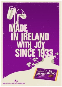
I really like these two posters because they have colors that are easy on the eyes (and the words contrast well against the background), they both get the point across with a few words, and the actual pictures that the words or lines make are very cool. For example, the chocolate poster shows milk spilling on the words at the top, and it gives the impression that the milk runs over the words and into the milk river at the bottom. The horizontal fire is very plain, yet quite eye-catching at the same time; the path that follows the plane forms an “F” (because of horizontal fire), and the words sit on the letter, not using up any more space than needed.
On my poster, I am going to try to have good spacing and not make it look crammed. Also, I am going to stick to two fonts throughout the whole poster and make sure that the word colors are easy to read.


I like the diagonal text as well. Could you use this in your piece? I also like the simple path. Could you draw a swirling line using the Wacom tablets? Then follow along with the type?