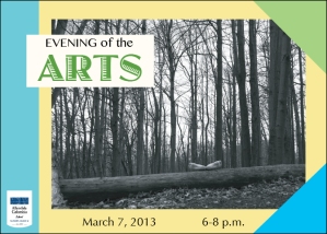
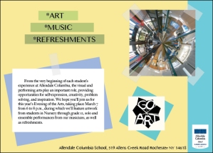
My original idea was use black and green to do the design. It is really different than this. This idea is make this postcard looks like a notebook. All the pictures and words kind of paste on the background. I was confusing about which colors could I use. I tried the black first but is not look that good so I change the color. I think the the back of the postcard is a little bit empty.


I love this! It goes with the artsy theme really well. I love how it looks like a scrapbook. It’s very different and i like that. Maybe instead of using the green triangle on top, you could make that purple so it connects to the purple box on the back of the post card.
很好看,不错 ! 继续加油! 很有明信片的感觉。 黄色的底 如果再淡一点就更好了。
Looking good, very good ! Keep it up ! Let me have the feeling of the binder. If the yellow on the background be lighter would be great .
The colors that you use compliment each other quite nicely and it looks like a scrapbook, in a good way. Great Job Grace!
I think this one is cool because it’s so bright. Like Sam said it looks like a scrapbook which is very different. No suggestions. AWESOME
Grace- this is really nice. I really like your background color and the little tilted boxes around the pictures, and how they compliment the rest of the piece. And even the AC logo looks nice in there too!! The font describing the date and time looks a little bland, so maybe think about changing that. But otherwise, this is really a nice piece and keep it up!!
I really like the use of the photos in this design. The placement and colors work really well. One suggestion I have is to maybe make the blue triangle the same color as the other blues on the design.
This postcard is really cool. The colors compliment each other very nicely and it looks very artsy. Like Sam said the only thing id do is change the color of the green triangle